
OCBC Business Banking Design Systems 1.0
Design ecosystems to maintain design consistency and brand identity across OCBC Business Banking’s digital platforms
Overview
STATUS
Completed
MY ROLE
Design Lead
Product Owner
UI Designer
TOOL USED
Sketch
Figma
I am the Design Lead for the OCBC Business Banking Design Systems 1.0. I lead a team of 4 designers building 2 sets of design systems (OCBC Business Banking App & Velocity Internet Banking) from scratch.
I am also the Product Owner of the design systems responsible for architecting the design systems, orchestrating the design operations with the development team and driving the product roadmap in accordance with the products and customers’ needs.
I established the first set of design systems for OCBC Business Banking domain.
Road to Design Efficiency
Streamlining design tools used
When I first joined the team, I was surprised that the team is using a myriad of tools in their day-to-day design work
Miro for Whiteboarding, virtual workshops
Sketch App for UI Design
Invision for Prototyping
I observed inefficiency with the usage of multiple design tools
No centralised document repository, designers have to scrawl across applications to locate their files
Time wastage hoping across applications in their daily work
Hence, I pushed the team to migrate all their work and working files to Figma/Figjam which is an all-in-one design platform which satisfied all our design needs
All-in-one Design Tool - Figma/Figjam

Establishing the first design system
Business Banking Mobile Design System
I was the design lead who led the team in the migration of our design working file from Sketch to Figma.
As I was leading the migration, I realised there wasn’t any design system in place and in tandem there is a new initiative to revamp the existing business banking mobile app.
Taking this opportunity, I managed to convince my stakeholders for me to build the design system for the revamped Business Banking app on Figma
Architecting the design system for scalability
While I was crafting the architecture of the design system for the business banking mobile app, I had in mind the design system to be scalable for potential expansion to incorporate the design system for internet banking (web).
Hence, I decided to set up 2 sets of design systems, one of each will be a Global Design System containing foundational design elements such as colours, typography and icons whereas the other is a Mobile Design System containing mobile-app-specific components such as mobile UI components.
Global x Mobile DS Architecture
Global Design System
Consist of foundational design elements that are applicable across digital platforms
Foundation - Colors and Typography
Global Assets - Logo, Icons and Illustrations
Helpers - Widgets that help with Figma design work i.e Gestures, connectors, flow title and project notes
Mobile Design System
Consist of mobile-app-specific design elements
Mobile UI Library - Mobile UI Components built via Atomic Design Methodology
Mobile Platforms - iOS and Android Components
Atomic Design Methodology

Atomic Design
We adopted the Atomic Design Methodology to build our UI components which involve breaking an application down into its basic components and then working up from there to create an application.
Base: Visual feel or visual stylings such as Grid, Opacity, Shadows and Border Radius.
Atoms: Represent the smallest entity in UI elements and they can’t be broken down any further. Think of them as Lego blocks. They serve as the foundational building blocks of your interface.
Molecules: Groups of atoms bonded together that take on distinct new properties. They form relatively simple UI elements functioning together as a unit.
Organisms: Relatively complex UI components composed of groups of molecules and/or atoms.
Templates: Pages without real content and articulate the design’s underlying content structure.
Pages: Specific instances of templates that demonstrate the final UI looks like and with real representative content in place.
Design Systems Site Map
Maintaining brand identity and design consistencies
Few months after the setup of the Global x Web Design systems. Our team started the revamp of OCBC Business Banking Internet Banking platform (web). With this new initiative, we replicated the setup of the Mobile Design System for the Web Design System.
Web Design System
Consist of web-specific design elements
Web UI Library - Web UI Components
Web Platforms - Google Chrome Component
Global x Mobile x Web DS Architecture
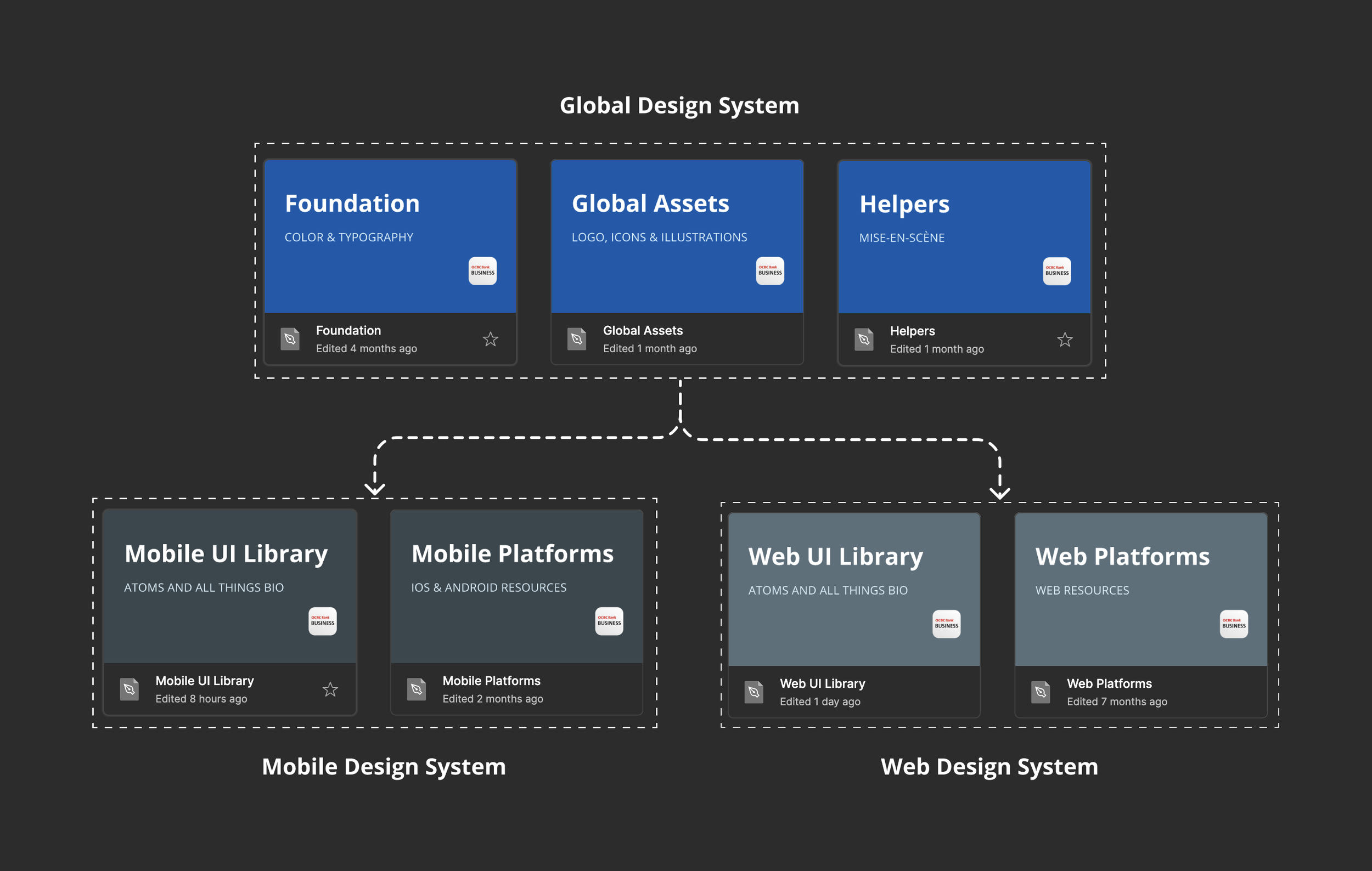
With the Global Design System as a parent to both the Mobile and Web Design Systems.
We are able to maintain brand identity and design consistencies across digital platforms by ensuring both platforms’ design system shares the same foundation i.e the same set of colour palette, typography scale and icons set
Text Fields (Mobile)
Text Fields (Web)
Going forward
With the web design system established.
The next steps I’m looking at are
Definition of design tokens to lay the building blocks for code components
Work with developers in building code components library